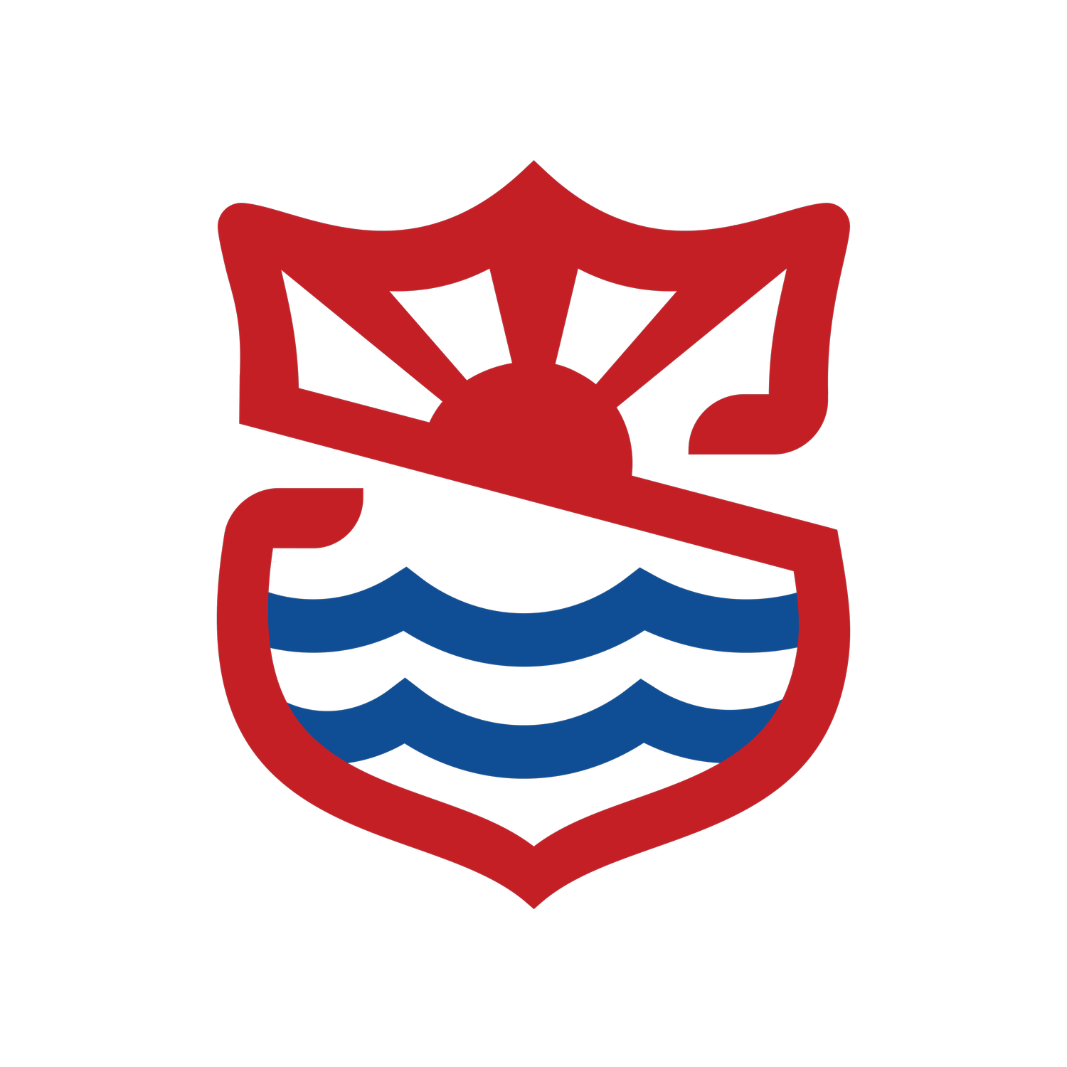
Complete Mark
The Full Logo
Four distinct layers combine to form the Jackson’s Point Retreat & Conference Centre identity. Each element carries its own meaning — but together help share the story of this place. We are defined by our faith, our heritage, our location and purpose. Use the tabs above or the arrows to explore each layer.
Heritage
The SA Shield
The outer Salvation Army shield serves as the backdrop of the mark. We are a proud Salvation Army Ministry unit, sharing the collective vision of the Salvation Army, existing to share the love of Jesus Christ, meet human needs and be a transforming influence in the communities of our world.
Purpose
The Slash
A bold diagonal band slices across the form. JPRCC’s mission is to be a place of retreat, rest, and renewal — a place to interrupt the regular cadence of our frenzied lives, and create space for the triune God to transform hearts and minds.
Source
The Trinity
While words and analogies fall short when describing the Trinity, the sun represents our belief in a triune God whom we serve, and from whom we receive strength, direction and purpose. The triune God is how and why we exist.
Place
The Waves
Two sweeping wave lines echo the shoreline of Lake Simcoe. JPRCC is located on a beautiful lakefront property offering the perfect location for rest, renewal, reflection, and fun!